- Client: CFA Institute
- Agency: Worry Free Labs / Pointclear
- Jan-July 2017
Challenges
- To design a new and modern website that supports the defined CFA Institute personalization strategy and enhances the organization’s Brand Voice and Value while lowering the overall cost of ownership for the platform
- To create a satisfying and cohesive experience for CFA Institute’s end users
- To define an effective omnichannel content strategy that cultivates a personalized customer experience through CFA Institute’s digital channels
- To create an effective and manageable digital governance framework that optimizes operations and can evolve with organizational goals by defining accountability, staff roles, and decision-making authority
Approach
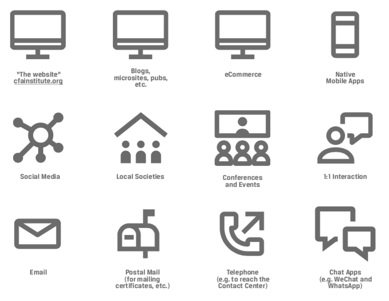
Channel Inventory & Content Audit
The CFA Institute produces a truly amazing amount of high quality content. One of the first steps in the process was to figure out what this content was, how it was organized, where it lived, and how it was distributed.
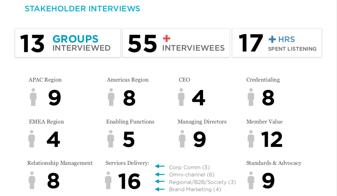
Stakeholder Interviews
We conducted stakeholder interviews to get a better understanding of the problem. The CFA is a large multinational organization with different stakeholders and end users. We wanted to hear from them. These interviews helped us determine who are users were and what their needs were for the site.
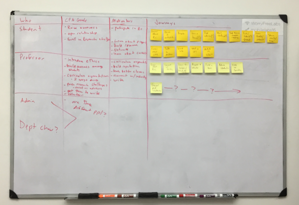
User Journeys
Once we understood who the users were and what they needed to use the website experience for, we began to map out their journeys. This helped us understand how a user might move through the experience, which would inform the overall architecture of the experience.
Discovering the right the IA
Once we had a hypothesis for the initial site IA, we used two testing techniques to validate. The first was a remote card sorting exercise, letting users and stakeholders organize the site content into the most logical structure. The findings of that led study led to a more “baked” IA, which we then further validated using remote tree tests.
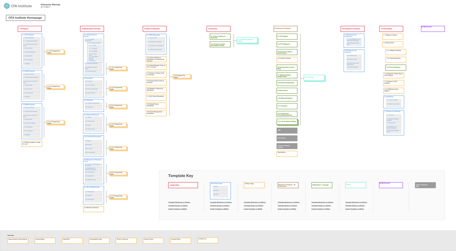
Final Sitemap
Collaborative Sketching
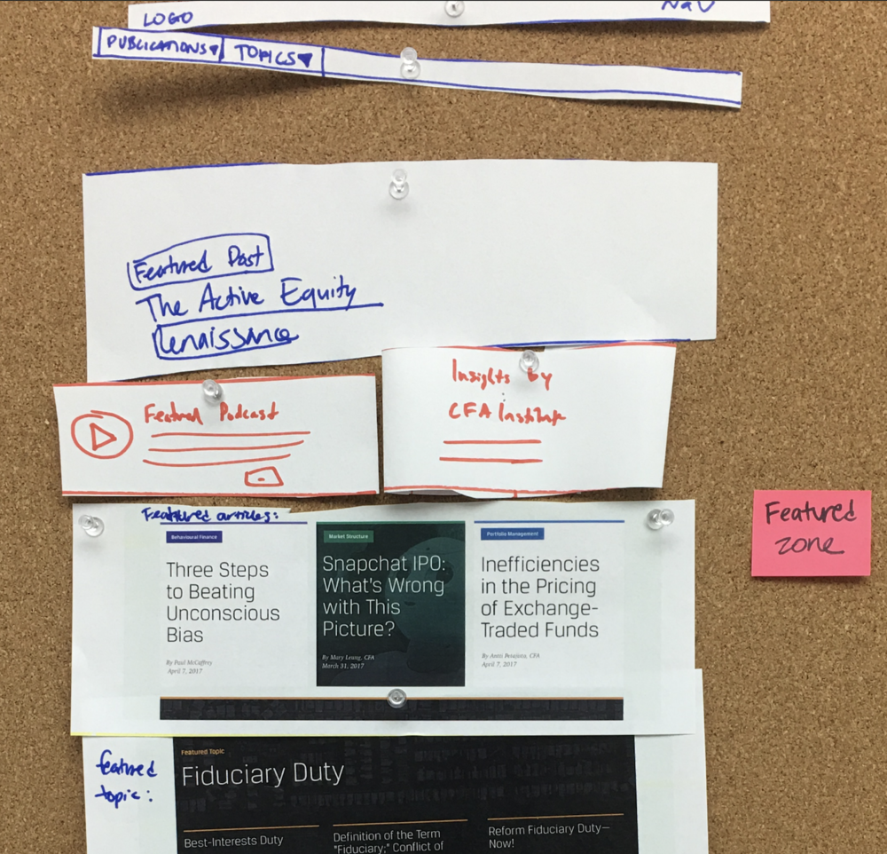
Once we had determined the IA and the necessary page templates to fill the site, the other UX designer and I independently took 1 hour to create 5-6 sketches for each. We then presented them to each other. We took the best sections from each page template, cut them out, and reassembled them on a cork board to create the ideal template.
We repeated this process for each of the page templates we were tasked to design.
Wireframes
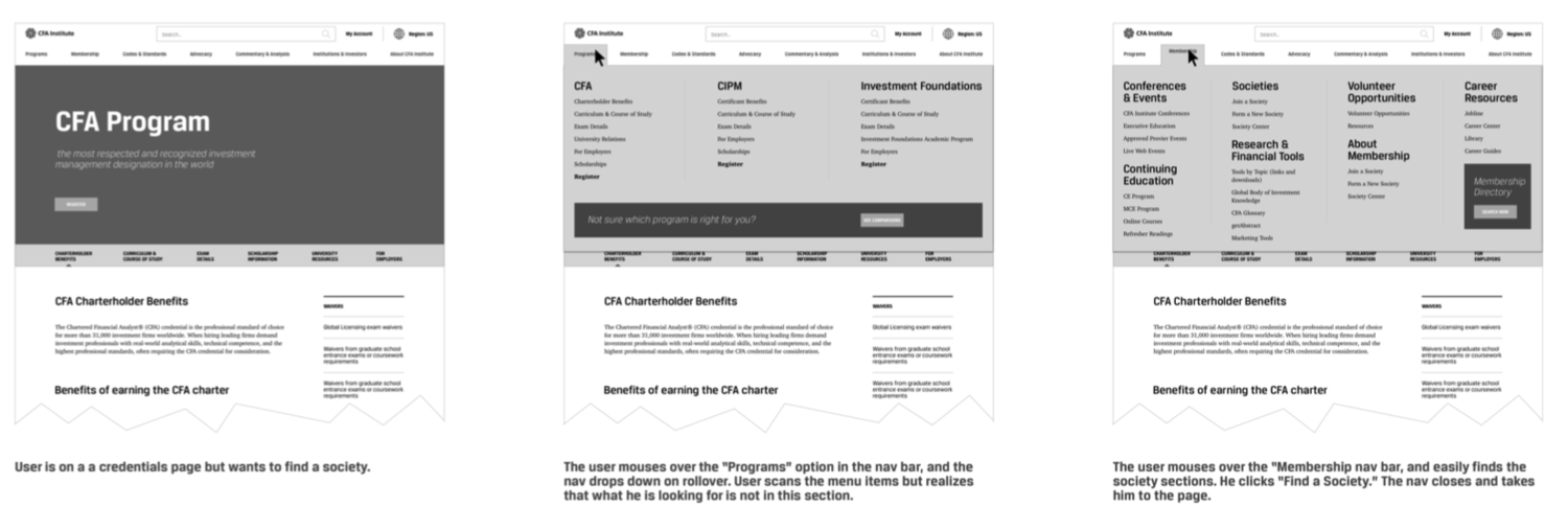
We turned these collaborative sketches into a large deck of annotated wireframes and passed them onto the visual design team.
Final
You can see the completed work at https://www.cfainstitute.org/