Challenge:
The various products at FIA Tech were either acquired from other companies or built by either in-house and contracted teams over the years. While these developers did a masterful job weaving these complicated, data heavy applications together, the design was something of a mess, with different visual and interaction languages across the different applications.
Additionally, as we added new features and brought additional products onto our platform, the application got more and more complex as new designs and interactions were required.
To try and tame the mess, I determined that a Design System could create a unified, “golden source” design language which could not only unify the product line, but allow for faster sprint deployments as design would not be a bottleneck.
3 Primary Goals of the Design System:
- Unify and create the “golden source” for visual styles
- Unify and create a master interaction language – elements and features needed to behave the same way across the various applications
- Scale Design Ops – as the sole designer among a team of 20+ developers in an agile environment, I needed a way to spin out designs at a rapid clip without sacrificing quality
Approach
We couldn’t simply change the way we had designed and built everything all at once – the introduction of this type of system had to fit into an existing agile development process that shipped every 2 weeks. The Design System had to be treated as an additional product to be developed in parallel with the other workstreams.
At first, I was thrown into the fire – as sprints went on I iterated the various components until finding the best solution. At that point that component was committed to the design system for reuse in subsequent designs. We would then retroactively update the old styles with the updated ones.
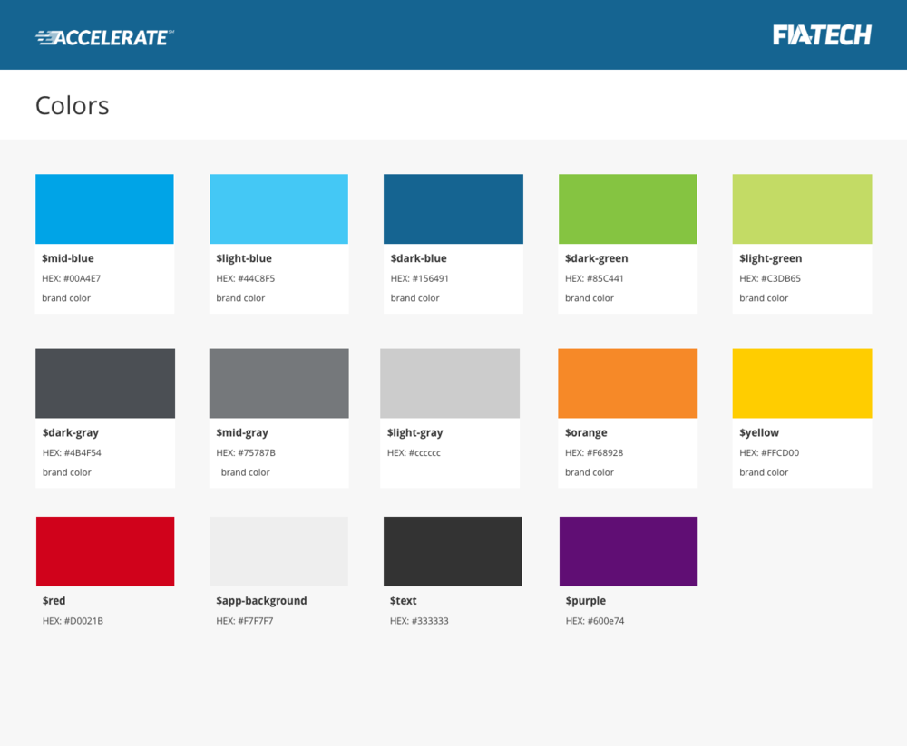
The best way to get up and running was with style and brand wins, such as colors, typography, iconography, etc. This was both easier to implement and helped the larger development team understand the value of such a system.

In the case of the colors, I defined them using both the HEX value as well as a SASS (CSS) variable. Now, when writing requirements or acceptance criteria I could reference the variable, making the developers’ lives easier and reducing mistakes in the process.
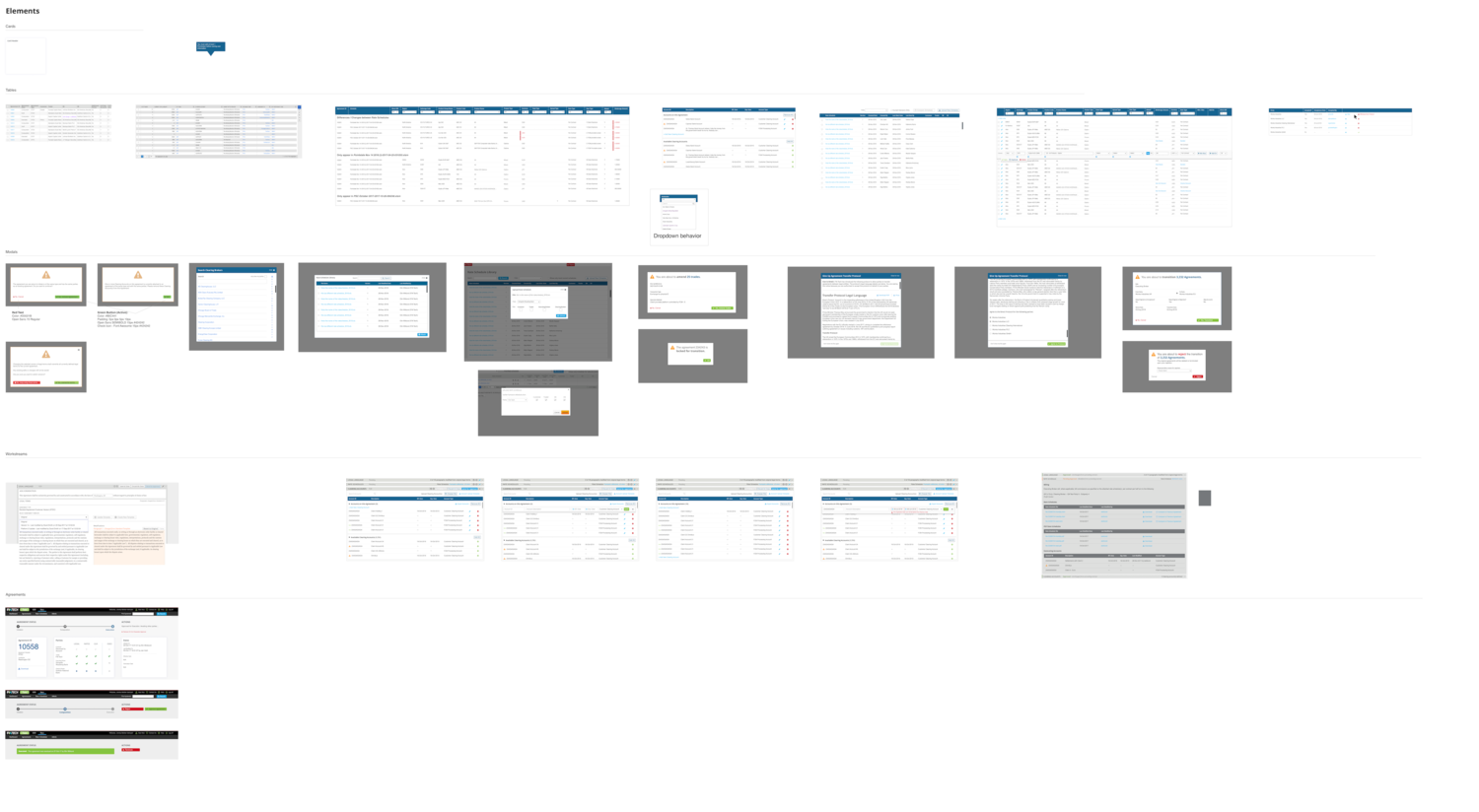
The next piece of work began to tackle some of the more nebulous pieces of the system. I started by creating an ongoing, living audit document in Sketch. As I moved through my design tasks within the sprints, I would save any newly components as well as screenshots of any existing components within the existing application into a large, messy Sketch file. Each time a certain component was called for in a new design task, I could reference the sheet and see if something usable already existed – if so, great news! If not, I’d create a new or iterate from an existing component, then save it in that same document.

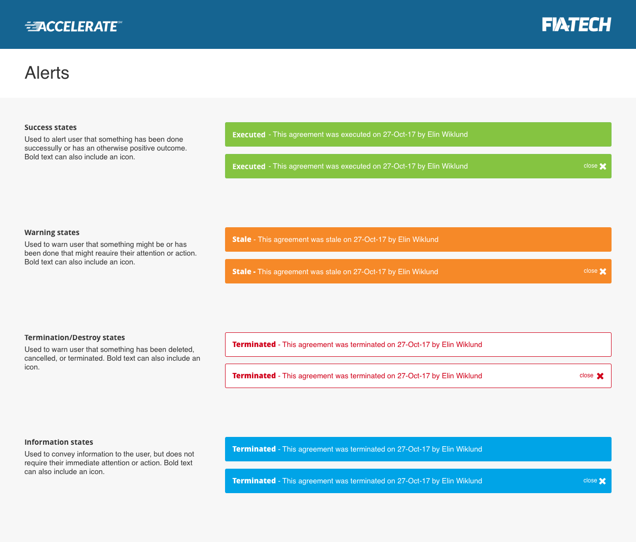
This living audit Sketch file became the basis of the design system. Within this same file, I created new Artboards for the formal system, with different Artboards for a variety of components. I then turned this document into a Sketch Library, which allowed it to be used in any new Sketch file. As time went on and I felt like I had a component “dialed”, I would add it to the formal Design System and codify it as a symbol.
I would also add “rules” or usage guidelines to each component, helping to determine when and why it would be used.

An added benefit of this system that was unintended but a useful surprise was the was the development a common taxonomy and vocabulary for the components in the application. Before, different components and interactions would be called different names – is it a modal or a light box? Lazy load or virtual scrolling? This system helped center the team around a common vocabulary, avoiding mistakes that come from disjointed definitions.
Solution
In practical terms – the design system both a Sketch Library as well as a coded application inside the platform itself, using the same CSS stylesheets as the applications on the platform (where possible). We then worked to slowly phase out the legacy style sheets in subsequent sprints.
As far as buy-in company wide, the system was generally welcomed by the developers who had been working without a lot of guidance and who had previously required heavy handed documentation that often felt more waterfall than agile. While not eliminating the need for requirements, it began to offer a “shorthand” vocabulary, reducing the time it took to enter requirements into JIRA.
True to its core mission, it drastically reduced the amount of time it took to create screens for new features and functionality, often cutting time to design a screen for development in half (or better).